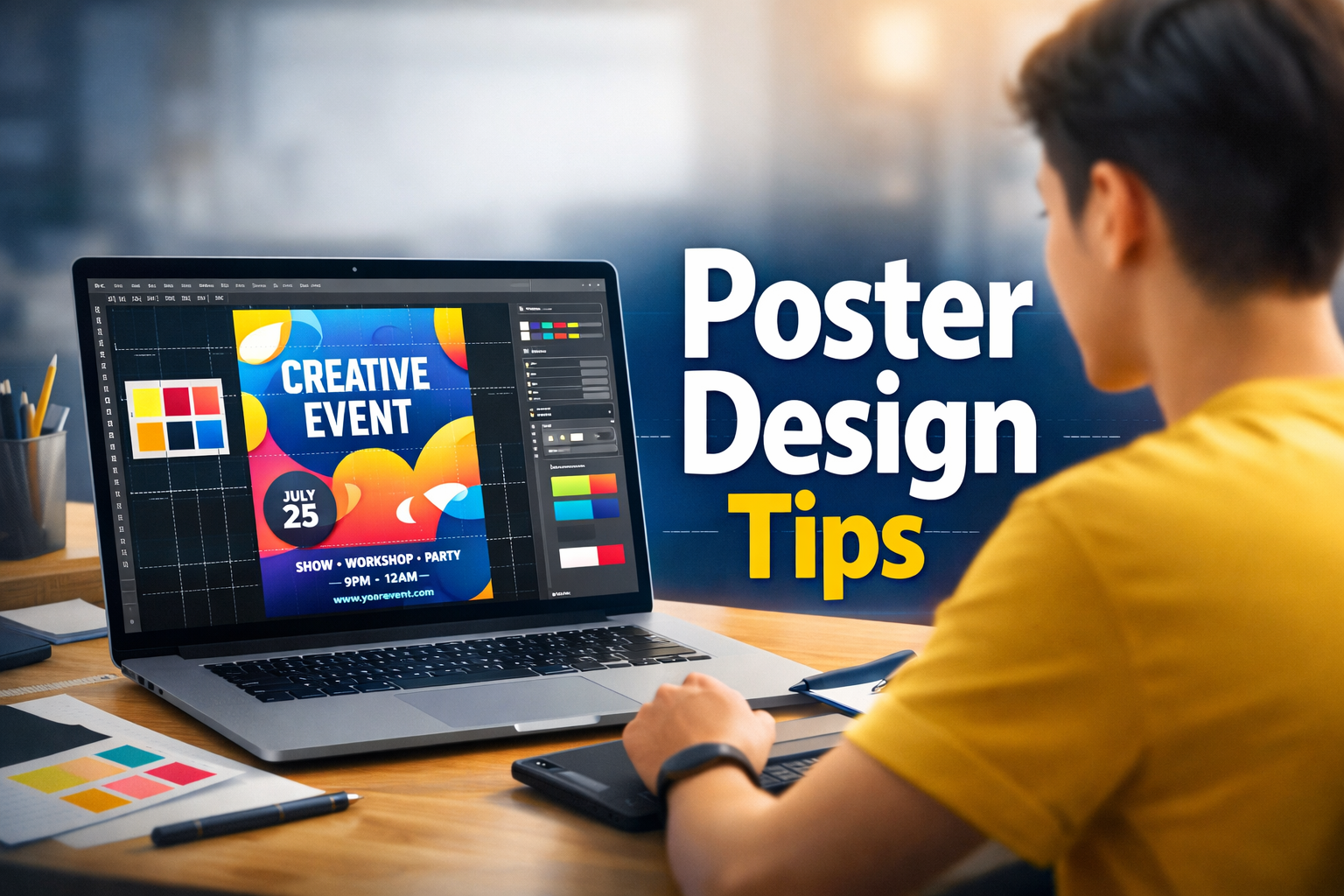
Professional Poster Design Tips for Beginners: A Step-by-Step Guide
Whether you are promoting a garage sale, a business webinar, or a university event, a poster is often your first point of contact with your audience. You have about three seconds to grab someone’s attention before they walk past or scroll away.
If you are a beginner looking to design professional-quality posters without the years of training, this guide is for you. Here are the essential tips to take your designs from “homemade” to “high-end.”
1. Define Your Goal Before You Design
The biggest mistake beginners make is opening a design tool without a plan. Before you place a single pixel, ask yourself three questions:
- What is the goal? (e.g., Get people to buy tickets, visit a website, or learn about a cause.)
- Who is the audience? (e.g., Corporate professionals, college students, or parents?)
- Where will it live? (e.g., A printed flyer on a bulletin board requires large text; a digital Instagram post requires less detail.)
2. Master the Art of Visual Hierarchy
Visual hierarchy is the secret sauce of professional design. It simply means arranging elements so the viewer knows exactly what to read first, second, and third.
The “3-Level” Rule:
- The Headline (The Hook): This should be the largest and boldest text. It isn’t necessarily the event title; it could be a catchy phrase like “Huge Summer Sale!” or “Live Music Tonight.” Readability from a distance is key.
- The Details (The Meat): This is the secondary information—the what and when. It should be about half the size of your headline.
- The Fine Print (The CTA): This is the smallest text, containing the website URL, ticket prices, or address.
Pro Tip: If everything is big, nothing is big. Don’t be afraid to make your headline massive and your fine print tiny.
3. Stick to the “Two-Font” Limit
Amateur designs often look chaotic because they use too many font styles. Professional designers usually stick to two fonts (max three):
- One for the Headline: Choose a bold, display font (sans-serif fonts like Impact or Montserrat work great).
- One for the Body Text: Choose a highly readable font (like Open Sans or Roboto).
Avoid: Comic Sans, Papyrus, or overly swirly script fonts that are hard to read from a distance.
4. Use High-Contrast Colors
If you print yellow text on a white background, no one will read it. Contrast is king in poster design.
- Dark on Light: Black text on white paper (classic and clean).
- Light on Dark: White text on a navy or black background (sleek and modern).
The 60-30-10 Rule:
Try this color balance to keep things cohesive:
- 60% is your primary background color.
- 30% is your secondary color (shapes, containers).
- 10% is your accent color (used for the most important text or Call to Action).
5. Embrace “Negative Space”
Beginners often feel the urge to fill every inch of the paper with text or images. Don’t do this.
“Negative space” (or white space) is the empty area around your elements. It lets the design breathe and makes the important info stand out.
- Leave a generous margin around the edges of your poster.
- Leave space between lines of text.
- If your poster feels cluttered, remove one element. Less is almost always more.
6. Use High-Quality Imagery
Nothing screams “amateur” louder than a pixelated, blurry image.
- Resolution: If you are printing your poster, you need high-resolution images (aim for 300 DPI). A photo that looks good on your phone might look blocky when printed on A3 paper.
- Stock Photos: If you don’t have your own photos, use free high-quality stock photo sites like Unsplash or Pexels. Avoid using watermarked images from Google Images.
7. The 5-Foot Test (For Print)
If you are designing a physical poster, print out a draft and stick it on your wall. Step back 5 feet.
- Can you read the headline clearly?
- Do you understand the main image?
- Is the call to action (e.g., the website or date) visible?
If you have to squint, your font is too small or your contrast is too low.
8. Best Tools for Beginners
You don’t need to pay for expensive software like Adobe Photoshop to make great posters.
- Canva: The gold standard for beginners. It has thousands of templates and an intuitive drag-and-drop interface.
- Adobe Express: Similar to Canva but with access to Adobe’s powerful font and stock photo library.
- Figma: Slightly more advanced, but excellent if you want total control over your layout (and it’s free!).
Summary Checklist
Before you hit “Print” or “Post,” check these five things:
- Is there a clear focal point (headline)?
- Did I limit myself to 2 fonts?
- Is there enough empty space (margins)?
- Is the contrast strong enough to read easily?
- Are all spelling and dates correct?
Conclusion
Great poster design isn’t about adding more—it’s about clearing away the clutter so your message shines. By sticking to a clear hierarchy, high-quality images, and simple typography, you can create professional designs that command attention. Now, open that blank canvas and get creative!